Showing posts with label typography. Show all posts

19.8.16

Lina Selander & Emma Hartman – Limited edition exhibition book

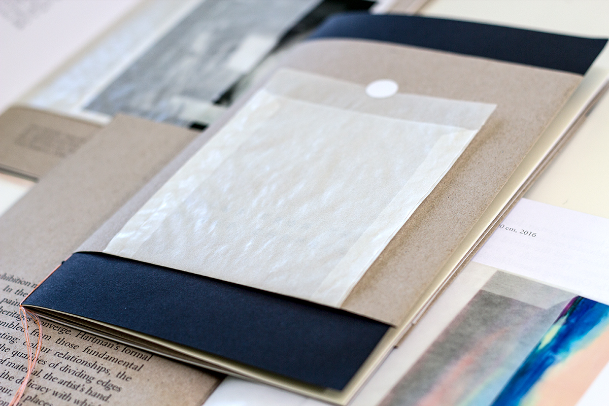
Limited edition book for exhibition of Swedish artists Lina Selander and Emma Hartman, curator Dobz O'Brien. Conceived and produced in response to Rory Prout's essay on the occasion of Speculative Fictions Exhibition at Sirius Arts Centre, Cobh, Ireland. Designed in Skibbereen, edition of 80 hand-crafted in Cork City by a team of many.


11.10.12

Swell Surf School Website


The team at Swell Surf School asked me to redesign their site this year. Collaborating with them was a demonstration of how actually great surf people are; so laid back and lovely. Inch beach in East Cork is the perfect place for learners as it has no mad crazy danger zones. It's beautiful as well. Petra Stone helped with thoroughly customising the Wordpress theme. I had fun creating a surfy vibe.
www.swellsurfschool.ie

22.11.10

Getting with the Web Type

Researching pleasing and beautiful web design with a fingertip close to the technical necessities leads one nto the classic alice-in-wonderland spiral of muchness. Without details, I'd like to share with you some rather jolly lovely places. Those of you out there versed in web-stuff will be rolling your eyes: "DUH! We KNOW all of these!" *I shrug*

First is the personal hub of Mr. Simon Collison, A.K.A 'Colly' who is undoubtedly a web-celebrity. He showcases Times New Roman lovingly.


Which brings us to 'The Elements of Typographic Style applied to the Web' a fabulous learning resource of detail for text styling in CSS2 and CSS3, by Richard Rutter elaborating the book by Bringhurst.


The Ministry of Type from Aegir Hallmundur which shows a broad but geekishly gorgeous set of porn-spirations. Old school but within a perfectly measured template.


Lastly, I bow to the HTML5 splendour of Magazin5 on Design Made in Germany. You can smoothly scroll the transparencies on your fancy-pants iPad but then be surprised at the quality content, such as an interview with Antonio Carusone, maker of the really very helpful champion of harmony The Grid System.

13.8.10

Rasmus Engelhardt Gundersen – Alfabetisk

I revisited Danish designer Rasmus Engelhardt the other week – (I know him from the MA in London College of Communication, where he was one of those with a sensitive typographic touch and unassuming manner). His work is grounded in a strong sense of playful modernity and rich heritage, which when applied to a museum environment or a city such as London, works wonderfully. 

10.2.09

Beautiful Hannah

It's tricky to find handwritten style typefaces that don't seem twee. Hannah is available in three different width proportions from youworkforthem